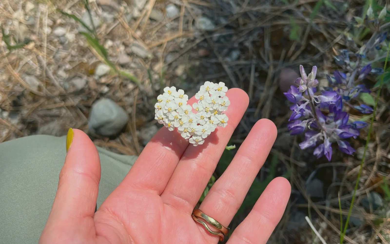
Most of my colour ideas don’t come from a screen. They come from outside.
Hiking around the Okanagan, digging clay in the studio, watching the lake change colour at different hours of the day — I’m constantly stealing palettes from nature. Terracotta. Sage. Mushroom brown. Sunbaked ochre. The warm cream of sand. The deep green of the forest when it’s about to rain.
And here’s why I keep going back to them: these colours feel honest. Our brains are wired to trust nature. When a brand uses colours rooted in the natural world, it doesn’t have to work hard to feel grounded, calm, or real. It just is.
Where I look
Everywhere, honestly. The bark of a ponderosa pine. Sagebrush after rain. A roasted sweet potato cut open. The clay I throw with on Saturdays — it starts one colour and fires into a completely different one, and somehow both versions work. If I see a colour combo I love, I take a photo and pull the palette from it later.
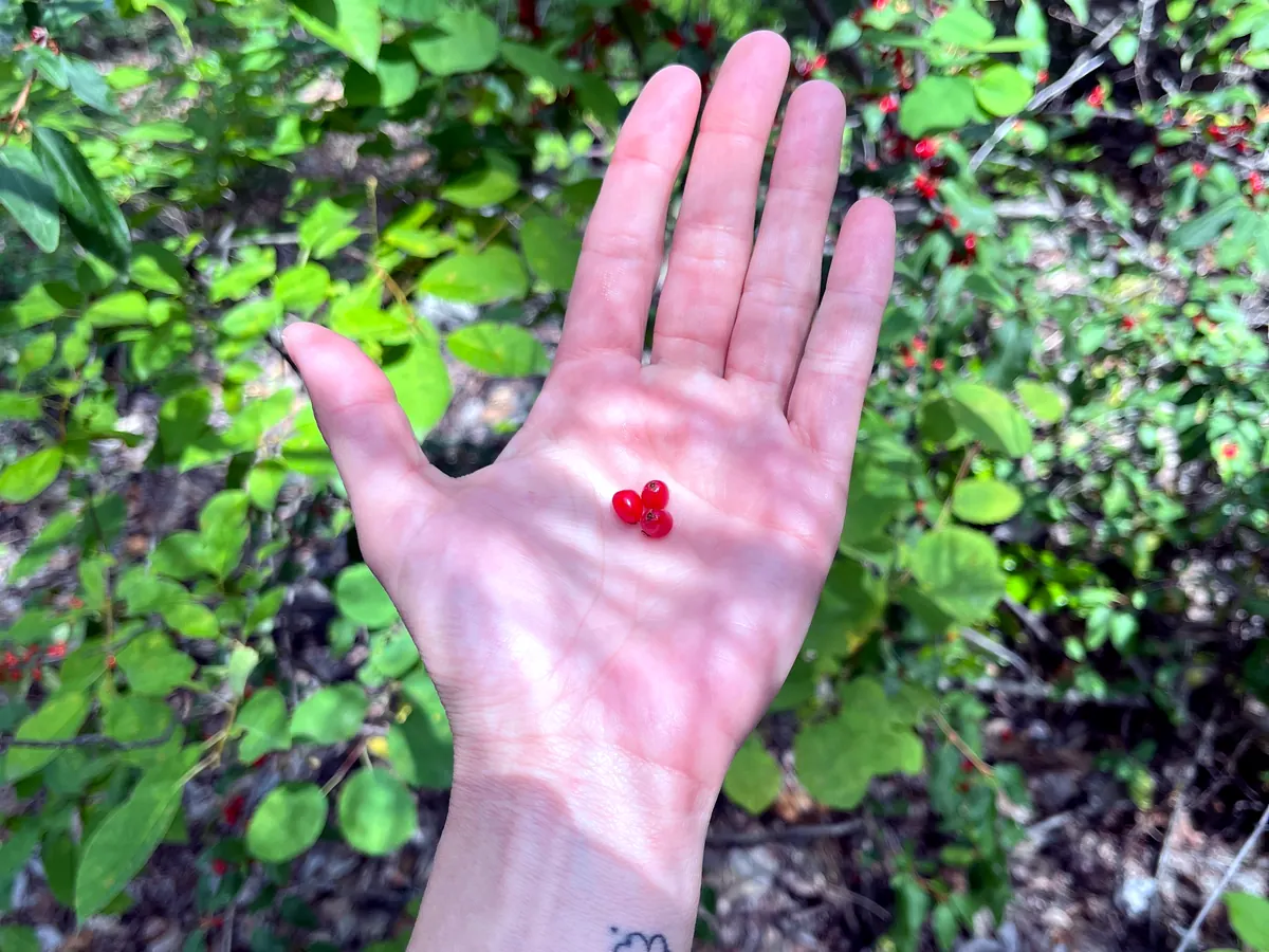
One small thing I’ve learned: nature rarely throws seven colours at you at once. Start with three or four. One warm, one cool, one neutral, one deep. Then let the white space do the rest. Restraint is the whole trick.
Nature never picks a colour that doesn’t belong.
This isn’t an accident for me, by the way. My own brand colours — the olive, the terracotta — came straight from this habit. They feel like me because they came from the places I love.
So next time you need a palette, go outside before you open a colour picker. The best design tool I have isn’t an app. It’s a walk.