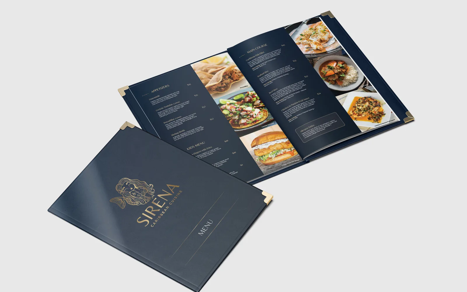
The other day, I sat down at a restaurant and read the menu twice. Once for the food. Once as a designer.
And here’s the thing — your menu is doing more talking than you think. It talks to your customers before your server ever gets to the table. Before the first bite. Before the music, the lighting, the vibe of the room. The menu speaks first.
People don’t read menus, they scan them. In about ten seconds, they’ve already decided how this place feels: cheap or fancy, chaotic or calm, fun or stiff. And honestly? They’re usually right — because a messy menu almost always comes from a messy brand.
I’m not saying every taco place needs a twelve-page leather book. I’m saying the design should match the food. A fun, delicious taco spot should have a menu that’s fun to read — big type, clear prices, descriptions that make you hungry. A quiet little sushi place should feel quiet on the page. Match the energy.
The little things
The little things are the big things. Prices people can actually find. Enough space between dishes so your eyes can breathe. Descriptions that sell the dish without a paragraph of adjectives. And please — a font that matches who you are. Your menu is not the place for a font you’d never use anywhere else.
People decide what to order before they talk to your server. Your menu made that decision with them.
So if you run a restaurant — or you’re about to open one — look at your menu with fresh eyes. Print it out. Hand it to a friend. Watch where their eyes go. Ask them what this place feels like before they taste anything. That feeling? That’s your design talking.
And if that feeling doesn’t match the food you’re proud of, maybe it’s time for a redesign. Your food deserves a menu that speaks as well as it tastes.